Urban Movement
  • Home
  • Projects
  • About
  • Us
  • Thoughts
  • Contact

If it looks nice, it’s good urban design. Right?  |  JOHN DALES

5/4/2013

 
Good decision-making must embrace qualitative considerations; but we still don’t really know how.
The context for the following comments is set partly by some work I’m currently doing to explore further the extent to which the ‘place’ value of streets and spaces can credibly be monetised, and partly by my rant a couple of months back relating to how conventional modelling outputs are often little more than ‘numbers masquerading as facts’.

What I want to talk about is a classic case of the following: ‘Not everything that can be counted counts; and what really counts can often not be counted’. In other words, while the reasons why we, as individuals, enjoy public space may be fairly easy to appreciate in broad terms, we struggle to put numbers to them. This troubles decision-makers who fear anything that smacks of subjectivity or opinion, even if it’s an opinion that they and many others plainly share. By contrast, a report with numbers has the appearance of objectivity to those same decision-makers, even if it may be, as Macbeth once said, ‘A tale told by an idiot… signifying nothing’.

The cover of the Liverpool Design Guide once asked the question: ‘Why is the city we are building so different from the cities we like?’ I just answered it, albeit partially.

You know how people say, “I may not know much about art, but I know what I like”? The challenge we face is to turn such personal expressions of satisfaction (or otherwise) with the urban realm into values that are suitable for assessment alongside those that are used for other indicators, such as traffic congestion and scheme cost. Until we are able to do this with reasonable confidence, we will continue to work in a decision-making environment where either (a) the ‘place’ function of streets is largely ignored unless a key individual with power imposes his or her opinion, or (b) well-intentioned but simplistic views about aesthetics lead to mistakes in functionality (such as in the case of what I call the ‘I Want One of Those Syndrome’). Neither is very desirable.

I may be being a little unfair, but I was reminded of issue (b) last week when working in ‘the Home of Horse Racing’ – Newmarket. There’s a key junction in the town that was changed in 2009 and is now a roundabout that seems to work well in motor traffic terms and is also, it must be said, much easier on the eye than would usually be expected. It’s helped by being right next to the town’s fine old Clock Tower, but the view is also improved by the complete lack of white lines and by fact that the low profile of the splitter islands means that they have not been disfigured by ‘keep left bollards’. There is a small handful of diagram 610 signs, but these are neatly set within four of the twelve large granite balls that form the central island. Some initial bad press was provoked by the fact that the granite balls were imported from China and cost around £1,000 each, but the commonly-held view today is that the junction’s ‘much nicer’ than it was. Unless, that is, you’re on foot.

The movement of pedestrians sadly seems to have been a lower priority than looks, despite this being a key location in the town centre. A desire to minimise the number of ‘ugly’ signs, lines and poles is laudable, but should not compromise usability for a priority user group. The crossing path on each of the four arms is around 12m across (10 seconds, or more if you’re slower than the average), yet apart from an almost-but-not-actually ‘zebra’ pattern on one arm there’s only non-contrasting tactile paving to assist crossing and only goodwill likely to make drivers yield. I was told that the design was justified by the lack of pedestrian activity at the junction. Perhaps I’m being harsh, but I think there’s been some confusion between causes and effects.

Another example of a good-looking scheme that also seems to work well in traffic terms is the ‘shared space’ reworking of a pivotal location in Poynton, East Cheshire. This is, with some justification, becoming something of a cause célèbre, and I wish it very well. However, I do hope that people will not make the mistake of judging its success too soon, and certainly not on the principal basis of how different it looks from before, or the well put-together Poynton Regenerated video that’s available on YouTube. All schemes, and especially one of such potential significance in terms of our understanding of better practice, deserve to be treated with much more respect than to be judged on appearances.

Based on research undertaken for both CABE’s ‘Paved with Gold’ report (2007) and Transport for London’s ‘Valuing Urban Realm Toolkit’, it’s been well established for some time that a better public realm leads to higher values for properties lying immediately adjacent. While the notion of ‘address’ may seem rather vague and somewhat subjective, house prices and rental charges are some of the coldest, hardest facts that there are; and I do believe this may be a way in to establishing a plausible and robust basis for translating “I like this street much more since they changed it” and “Let’s grab one of these tables, have a coffee and watch the world go by” into figures that fairly reflect the value that people like you and me actually put on that elusive quality sometimes called ‘sense of place’.

In the mean time, in our design work, we need to keep doing our best in exercising wise judgement over whatever evidence can be found, be it quantitative or qualitative. This is a task that the panel presiding over the annual Urban Transport Design Award has become accustomed to since it was inaugurated in 2005. Presented at the Transport Practitioners Meeting in July, it’s for transport initiatives that improve not just ‘movement’ but also ‘place’. If you know of any such schemes, whether from personal experience or professional involvement, why not let me know at j.dales@urbanmovement.co.uk?

Picture
Newmarket: low-profile islands, no lines and few signs. Nice. But is that enough?    

Picture
Newmarket: it looks a bit like a zebra, if you can see it, but there’s no pedestrian priority.

Picture
Poynton: the looks are important, but not the main criterion on which to judge success (picture from Ben Hamilton-Baillie).
Schrödinger's Cat link
14/4/2013 11:13:06 am

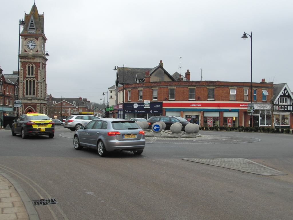
"While the reasons why we, as individuals, enjoy public space may be fairly easy to appreciate in broad terms, we struggle to put numbers to them."

I wonder if you're aware of TfL's Urban Design team's tool which attempts to translate the fuzzy feelings of niceness into the hard financial data which decision makers require.

Or as they more soberly put it themselves: "a financial tool to value urban realm projects and produce business cases for new projects."

George Weeks spoke about it at December's Movement for Liveable London Street Talks. Their website is https://urbandesign.tfl.gov.uk/

John
14/4/2013 10:00:10 pm

Thanks for the comment. You may be glad to know that, when I referred to "some work I am currently doing" in the first paragraph, this is, in fact, for George and his Urban Design colleagues at TfL. The work in question is the development of the Valuing Urban Realm Toolkit that George spoke about at the December StreetTalks event and, hopefully, it will indeed help result in more rounded business cases being made for new streets projects.

Schrödinger's Cat link
15/4/2013 10:27:07 am

Ah, I'm glad you're in on that – I thought you might well already know about it! Looks like a really interesting tool, which should result in some changes in the way friendlier streetscapes are seen by the beancounters.


Comments are closed.

    RSS Feed


Copyright 2021
Urban Movement Limited

Privacy
Picture
  • Home
  • Projects
  • About
  • Us
  • Thoughts
  • Contact